I'm taking MIT's 6.831: User Interface Design and Implementation through their free OpenCourseWare website. One of the homework assignments is to find two examples each for the "UI Hall of Shame" and the "UI Hall of Fame". This post is for shame -- and since the nominee has so many things to discuss I'm only doing one; I'll follow up with fame in another post.
My nominee for the UI Hall of Shame is gmusicbrowser, which has a number of UI problems. I used this app for a while last year because it has a couple of neat features that I liked, but I got frustrated by it (and it doesn't tie into my multimedia keyboard play/stop/forward keys), so I moved on to something else.
- A minor point, but the "About" dialog is not on the Help menu, it's on "Main" (which is nonstandard; it's where you'd normally find a "File" menu).
- There isn't a "Help" menu.
-
The two (three? four?) icons below the menu are confusing at best. None of the following behaviors are what you'd expect, and not everything is consistent.
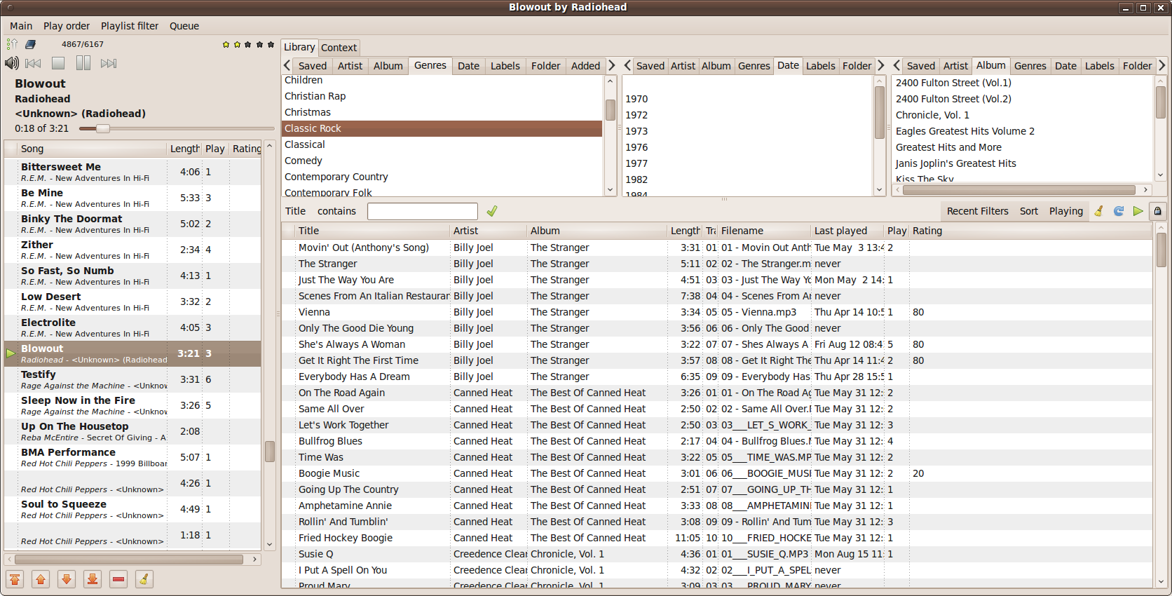
- To the right of the icons is a pair of numbers, like "4972/6158". This represents the sequence number of the playing song and the number of total songs in the currently displayed playlist. Nothing wrong with this -- but we'll come back to this in a minute.
- The first icon can be clicked to toggle between in-order and weighted-random modes. By right-clicking you can get a context menu to adjust the in-order mode (e.g. Artist/Album or Path/Track#). The selection for weighted-random mode is on a submenu of that same context menu.
- When you select a mode, that menu item gets a little indicator dot. It might be my desktop color scheme, but white-on-gray is hard to see with a dot that small. Firefox, for example, uses a checkmark which is easier to see even though it's still the same low contrast.
- Choosing a weighted-random mode changes the icon to dice.
- You can choose "Shuffle" from the menu, in which case the icon changes to playing cards.
- Clicking (left-click) on the dice or cards icon changes it back to the arrow icon and sets the mode to an in-order mode.
- Clicking on the arrow icon changes it to whichever random/shuffle mode was previously in use.
- The second icon starts as a book. I'm not sure what this is supposed to mean. When you hover over it, it says "Playlist Filter: All". Again you can right click for a context menu of filters to apply to the playlist, in which case the icon changes to a funnel. (And if a song is playing, it will abruptly change to whatever is first in the selected filter.)
- Clicking (left-click) on the book icon doesn't seem to do anything.
- Clicking on the funnel changes it back to a book (and the "All" filter?).
- Not that it would make much sense, but for consistency I'd expect a left click on this icon to toggle between "All" and the last selected filter.
- Next to the book/funnel icon is a blank space... that becomes an arrow/triangle ("play button") icon when you hover, with the tooltip "Queue empty". And when you move your mouse off the icon, it disappears.
- If you enqueue a song, that queue icon appears. And the pair of numbers mentioned above is replaced by the text "1 song in queue". But the playlist doesn't change! If it's still got 50 songs, you're still listening to, say, 12/50.
- Clicking on the queue icon... empties the queue! Which is very much not what you'd expect. Of course, since the queue is empty, the icon disappears and we get back our "NNN/XXX" text mentioned in the first bullet above.
- Now let's say you've got 5000 songs in your collection, but you're listening to a playlist that has 10 songs. You see, say, 2/10 in the indicator, and you've got the funnel icon (not the book). Just for fun, you enqueue a song using the main browser window. After the current song is playing, your queued song will play -- and the funnel icon will switch to the book icon: your selected filter has been cancelled.
- There are more unpredictable behaviors buried in these icons, but what all of this boils down to is that there are too many modes, they are not orthogonal, it's too easy to accidentally change from one mode to another, it's not easy to know what mode you're about to switch into, and it's really easy to lose work -- by accidentally clearing a bunch of queued songs.
-
Just below those icons are a mostly standard set of back/stop/play/forward icons... and a volume control that is really hard to use. Clicking the volume icon pops up a slider that disappears as soon as you release the mouse button. If you hold down the mouse button, the slider stays displayed, but you can't move the slider thumb. Double clicking the icon (which I discovered accidentally) makes the slider stay, and then you can move the thumb -- as long as you don't accidentally move the pointer outside the slider, in which case it disappears again. Right clicking toggles mute, which isn't intuitive, but if you really want to tie a behavior to right clicking on that icon, I suppose is reasonable. For mute, however, it's totally unusable: that icon is too small of a target, and when I want to mute, I'm usually trying to do it somewhat quickly -- so I can answer a ringing phone, for example. The mute button on my "multimedia" keyboard is a much easier target to hit quickly.
- The main browser window is a mystery to me. Starting at the top, there are two tabs: Library and Context. The only thing in the Context tab is a checkbox for "Follow Playing Song"; I'm not really sure what this does. Assuming it does something meaningful, it would make much more sense to put this on a menu somewhere.
-
The Library tab is where you can browse your music library. There are three listboxes at the top of the window, each with the same set of tabs. Those tabs change the listbox contents so you can choose various filters. Selecting a filter in the leftmost box (e.g. clicking on an album name after you've clicked the Album tab in that box) filters the contents of the left two listboxes. In this way you can drill down by choosing up to three filters. E.g. "Rock" in the left list from the Genre tab, then 1988 in the middle list from the Date tab, then Money for Nothing in the right list from the Album tab. This is kind of a clumsy approach to filtering, but in practice you don't need more than three filter selections to narrow even a large library significantly. The filters are a clumsy but reasonable approach. The difficulties start with the bells and whistles. You can right click on any of the three listboxes for a context menu.
- There's no other way to access the features in the context menu except by right clicking on the list. But right clicking on the list selects the list item where you clicked -- a minor annoyance.
- One of the menu options is "Show Buttons", which makes a toolbar appear below the listbox. Seriously? Why not just show the toolbar all the time?
- A minor point: one of the buttons is a broom icon for "Clear Selection". When you click this, the selected item in the listbox above is deactivated. But the item is still selected. The selection should instead be removed.
- The buttons that are displayed depend on which tab is selected. This is nonstandard: normally you disable a button instead of hiding it if the functionality is unavailable for the current mode.
- There's an "Intersection Mode" toggle button. I haven't been able to figure out what this does; nothing meaningful as far as I can tell.
- There's an "Options" button that displays a menu of display options.
- There are a confusing array of display options, all of which depend on the currently selected filter tab. When looking at the Date tab, for example, you can choose between a standard list or "cloud" mode. (I'll admit that having cloud mode available is kind of nice -- I can see 30+ years all at once instead of having to scroll.) If I switch to the Album tab, there are many more choices: six different sort modes; optionally displaying year, song count and running length of each album; five choices for showing album pictures and size to show; and the choice of cloud or "mosaic" mode. Mosaic mode is like "Icon View" in Nautilus -- albums are listed left-to-right with art shown where present and text where no image is available.
- I won't get into all of the behavior here, but the bottom line is: too many modes, which are not orthogonal, and your options disappear depending on mode -- without having a clear path to getting back to the option you were using.
-
Just below the listboxes (and optionally the listbox-specific toolbars) is another toolbar with a filtering control, a few buttons, and some menus. The menus don't belong here: they belong in the app's main menu bar.
- The "Saved List" feature is completely unusable. There's a menu option "Save current list as" that can only be found on the Saved tab in the filter listboxes -- but you have to be careful to click on the "Saved Lists" item in that list, because it's the only place you can right click that won't alter the filter contents displayed in the main window. I don't know if the feature is buggy or what, but clicking on a saved list doesn't consistently display the contents of that list.
- Overall, I'd put it down to a bad case of featuritis. I don't think there's a widget that hasn't been used in the UI, things are in nonstandard places, features are hidden in context menus, and there are way too many unexpected behaviors.
If I were going to implement a similar music player with advanced, highly flexible filtering; playlist construction; an ad-hoc queue; and flexible playback sequencing (e.g. in-order with various sorts, or weighted random according to various criteria) I would:
- Make three explicit playback modes: queue, filter, or playlist. You can edit any object regardless of which is playing, but, for example, changes made to the queue don't affect playback in playlist mode. This makes it easier for the user to figure out what he's currently working with -- and would actually enable new features like "save current queue to playlist".
- Similarly make three explicit editor/browser modes. You're editing a specific (i.e. named) filter or playlist, or you're modifying the queue.
- The player and the browser/editor would be distinct. Changes in the browser don't implicitly change what's happening in the player (except for the queue -- which you expect to make fluid changes to the player). If you're editing the actively playing playlist, you have to explicitly save your changes to the playlist for them to take effect. There are no editing controls in the player (e.g. moving songs up and down in the list).
- Retain some of the context menus where they apply to the selected object (e.g. "Song Properties" when you click on a song in a list), but I would move many options into the main menu.
- Use a more familiar UI for building filters. Something like what you see in the "Rules" window for email clients, for example -- AND/OR selections along with different filter rules. This would let the user build filters just as complex as gmusicbrowser allows but easier to navigate (in fact, gmusicbrowser has a window with this sort of interface).
- Retain (and expand) the status information: song index, total song count, total play time, remaining play time, etc. Probably in a status bar, but possibly in the header of the player.
- I didn't mention it above, but I'd retain the awesome bulk modify feature with some tweaks for usability. (Feature is cool, usability in gmusicbrowser is fair to poor.) This feature allows you, for example, to rename a whole batch of files according to a template, e.g. "<ALBUM> - <TRACK#> - <TITLE>.mp3". It also allows you to make bulk changes to the ID3 tags on a bunch of files all at once.
- Integrate with mmkeys.
- Minimize to the tray, and possibly have a shrunken player window that just shows a standard set of stop/play/pause/forward/backward icons, title, etc -- instead of needing a big library browser and/or playlist window open all the time.